Recently, you could say there were no serious movements in MoSKito Camp. But this was just a tactical trick, the calm before the storm.
Now we’re back with a bunch of updates! We shall describe them one by one, so that you could feel their true value. So, today’s special is…
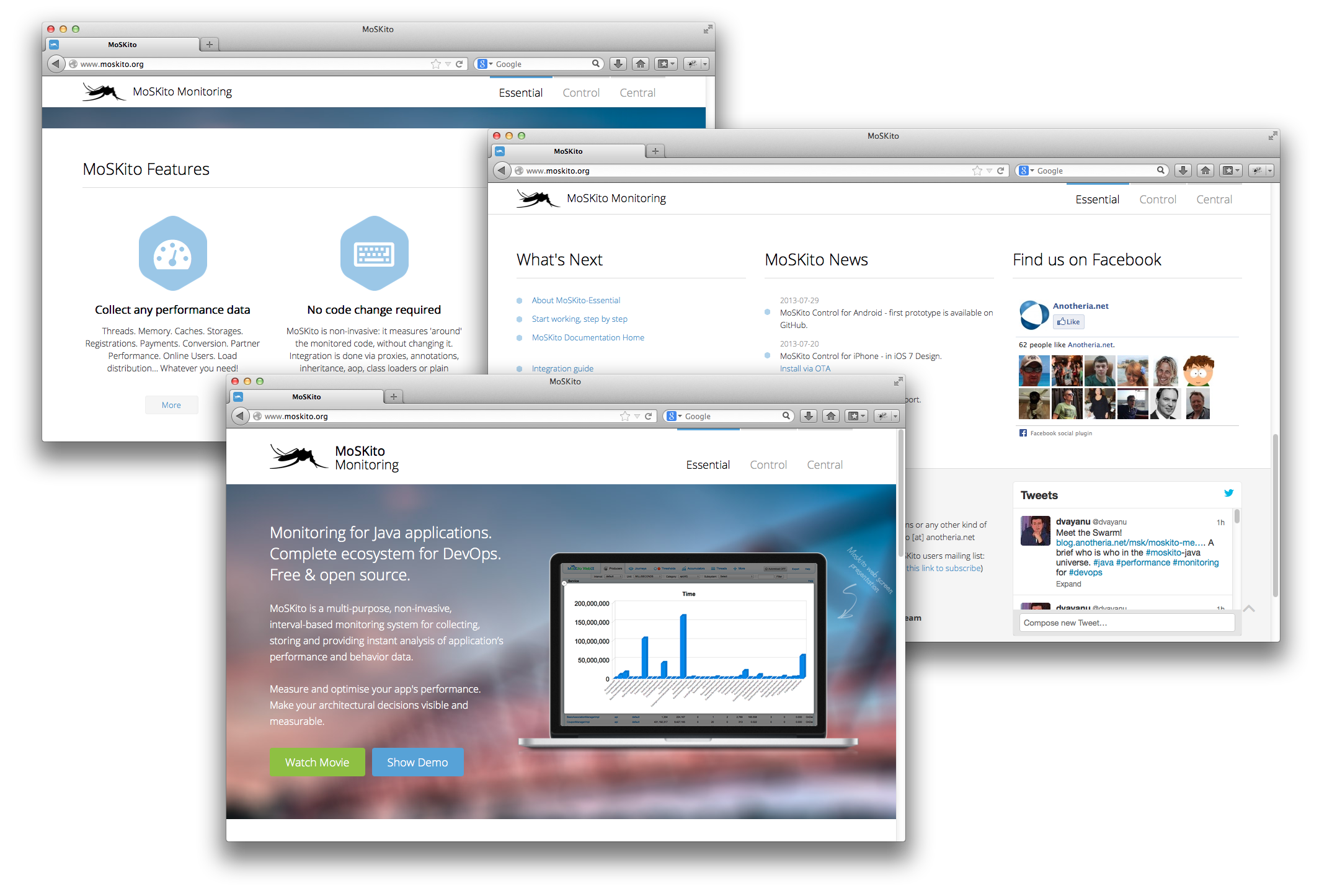
Brand new moskito.org website!

Let’s take a look and say why is it great.
Shiny new design.
We used the latest Bootstrap (2.3.2) to make the site look great. Now it has much more bright graphics and uses animation effects.
Simple, clear and minimalistic structure.
The previous website was way too informative. It contained a lot of useful info, but it was easy to get lost in it.
The new site is minimalistic in the best sense of the word. Now you can instantly see what MoSKito is made for, its strong points and what differentiates it from other monitoring solutions.
But this doesn’t mean we have thrown away the info. If a feature seems interesting, just click “More” and find all the info you need on our Confluence Documentation Page.
What’s Next section
Many people were slightly confused after visiting the old website because they could not understand how to proceed and what to do next.
Now, with What’s Next section, you have a step-by-step guide to start using MoSKito.
It looks amazing, we all love it!
No comments here 🙂
Feel free to visit us at www.moskito.org and let us know what you think about it!


